Surviving is not the answer, make your perfect meeting!
Organising without stress!
The project was born from the need to make a short and focused meeting on line. Organising a meeting is sometimes difficult, especially when you are in different country with different problems of laguage, timezone, background, etc… and you have to keep higher the attention of your audience.
Along the project, I was the Local Leader organising a number of workshops involving every key player from the company in the design process.
- The client is a smart company that wants to plan meeting without losing time
- I start working on it on March 2019 with a small team of UX Designer (5)
- I was the facilitator during the brainstorming and the UX Designer
Our aim was to use the Design Thinking method in order to create and test a real platform. At the beginning we didn’t know anything about the target so we started from the beginning with the Empathise phase.
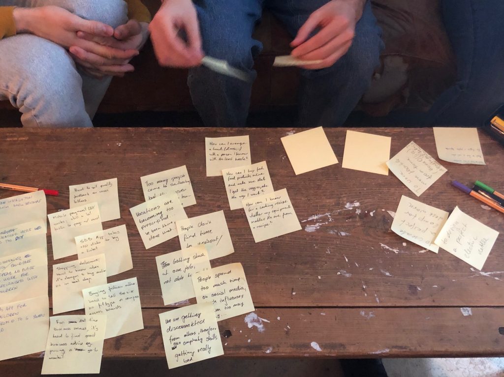
1) EMPATHISE:
How can we know the needs of our users?
About Interviews
At the discovery phase of my project, I conducted user interviews in order to get a better understanding of the problem.
Target: designers / developers / project managers / managers
The target group was men and women from ages 22-44 years old.
We interviewed 10 people:
Marco (Software engineer, Manager) 44 years old, Manuel (Enterprise SW Sales) 30 years old, Monica (Fashion Agency Owner) 28 years old, Lue (Product Manager) 27 years old, Jerome (Software Engineer) 28 years old, Oksana (Senior Analyst) 34 years old, Konstantin (Game Producer) 36 years old, Nikita (Game manager) 28 years old, Maksim (Developer) 26 years old, Julia (Event Organizer) 22 years old.
Questions:
- How often are you organizing online meetings?
- What’s the context of your meeting? (country, place, time, participants)?
- What technology do you use? apps, plugins, etc…?
- What’s the goal of your typical meeting?
- Describe the process of organising the meeting
- What do you do during the meeting?
- What do you do after the meeting?
- How a good / stress-free meeting looks like for you?
- How a bad / stressful meeting looks like?
- Where can you meet difficulties?
- If you have issues, how do you solve them? instruments e.g. phone?
- Which part of the online meetings you like the most?
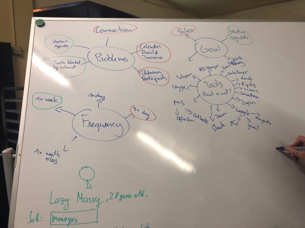
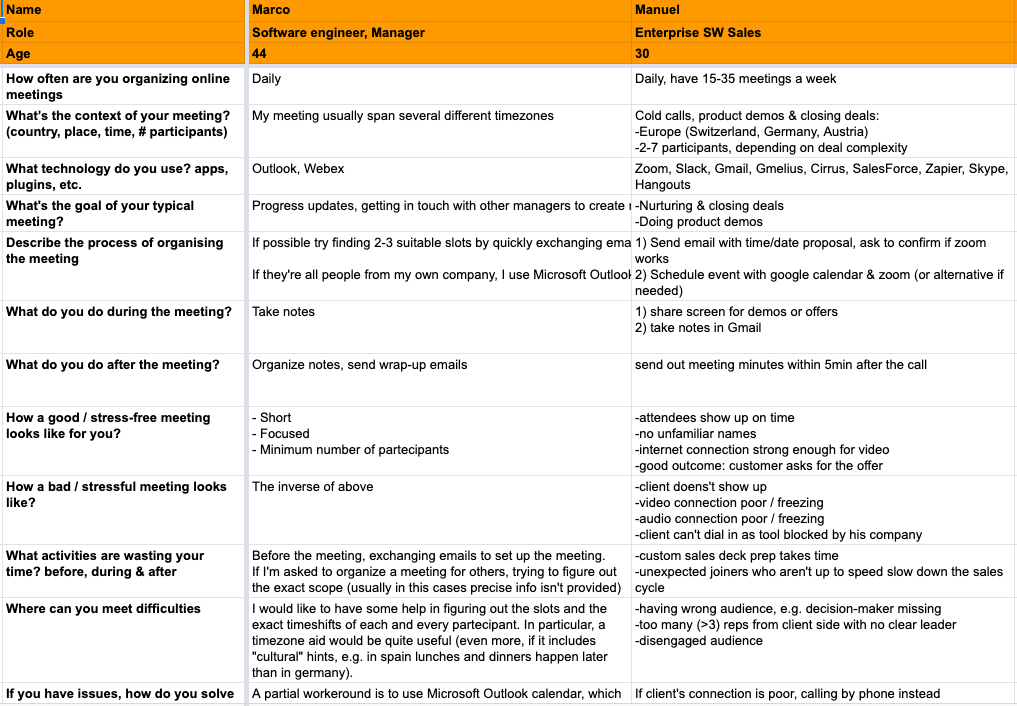
Example of Interviews Result
We have made interviews to understand user needs and problems.
2) DEFINE:
Problems and structure
Problems :
- Time (fixed by a remind alarm)
- Timezone (fixed by merging all calendar and proposing 3 solutions)
- Culture (fixed by no video calls and a fresh profile, two proposal: un-customized profile or customized profile)
- Language (fixed by speaking the same language in minimum B2 level)
- Connection (fixed by trade, co-working and home)
- Age
- Bored (fixed by gamification, incentive at the end – gift)
- Number of participants (fixed by an automatic system combine the resources about budget, project, availability and finally the manager approve the invitations, send the topic

Pre-Meeting
- Time/timeboxing/timezone
- Number of people
- Define topics, agenda, docs
- Software (tools free or not)
- Hardware
- Enviroment
- Expectations/outcome goals
Meeting
- Culture
- Language (accent, role, education)
- Connection
- Age
- Engagement/Interest
- Number of participants
- Manage documents
- Missing context
End of the Meeting
- Feedback quality
- Engagement
- feeleng control (correspond to Agenda
- Administration access to the docs
- Results
Personas
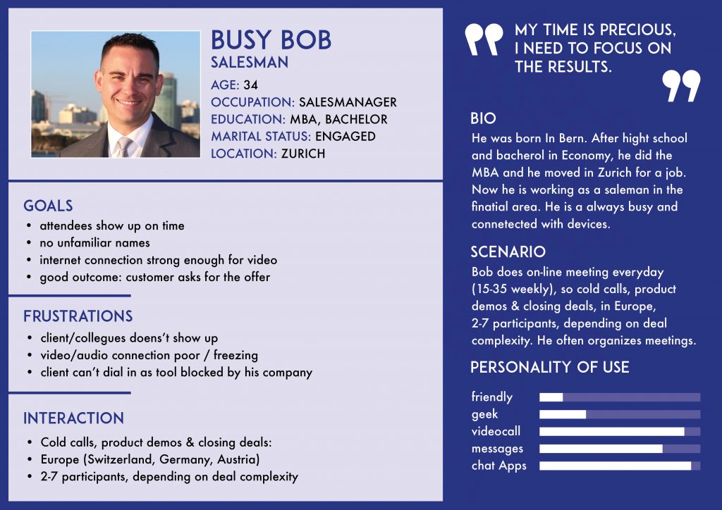
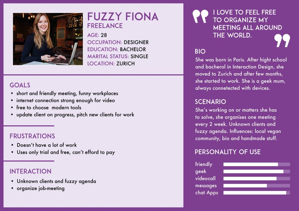
Based on the interviews/workshop we set up two personas. We referred to them throughout the entire product development process.
- We use interviews and user reaserch for developing the Personas
- At the moment that the users needs were unpersonally we realized that we need Personas
- We provide information about biography, scenario, goals, interactions, personality of use and frustrations
3) IDEATE:
Worst possible idea and SCAMPER
Worst possible idea
- increase ancient system
- just call
Customer Journey
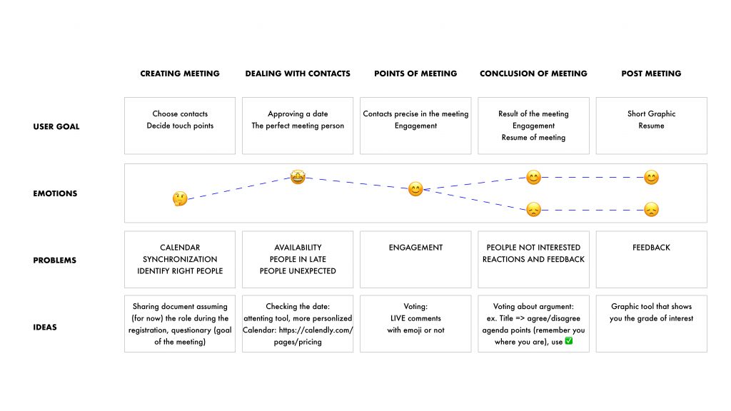
In order to get to know our users’ behaviour better, we created a Customer Journey Map.
Guiding Questions:
- What was the whole buying process from the point when the user do not even know the product? What happens after using the product?
- What were the main touchpoints where the user contacted with the service?
- What were the main painpoints for the user during the use of the service?
- What functions, solutions did you find out to treat these painpoints?
SCAMPER method
Substitute
Can I substitute common calendar? – Yes, because the solution allows us to merge and find three proposals
Combine
Can I combine without sharing my Privacy? – Yes, with three slots and not showing the members calendar
Can I combine our idea like on Doodle? – Yes, by implementing the system of voting
Can I combine with other slide-share App? – Yes, by implementing it
Adapt
Can I adapt to everyone? – Yes
Modify
Can I modify other situations from other systems? – Yes
Put to another use
Can I use it for other meeting purposes? – Yes, for family/friends/hobbies meetings
Eliminate
Can I eliminate video-calling? – Yes, by using a profile picture
Rearrange
Can I rearrange the old UX with a new one? – Yes, with an intuitive system and a good analyze of UX
Trying to fix some problems:
- Time >> (fixed by a reminder alarm)
- Timezone >> (fixed by merging all calendars and proposing 3 solutions)
- Culture >> (fixed by no-video calls and two proposals: un-customized profile or customized profile)
- Language >> (fixed by speaking the same language in minimum B2 level)
- Connection >> (fixed by trade, co-working and home)
- Age >> (fixed by Minimum age)
- Engagement >> (fixed by gamification, incentive at the end – gift)
- Number of participants >> (fixed by an automatic system which combines resources about budget, projects, availability and approval by the manager by sending invitations and topics)
4) PROTOTYPE:
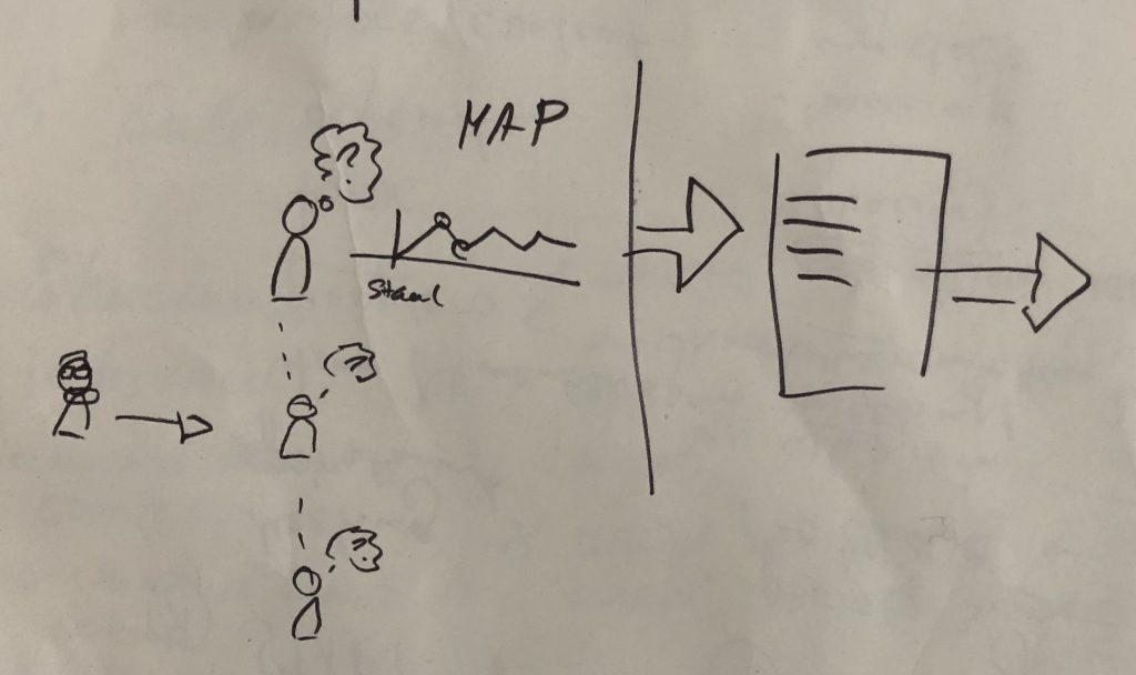
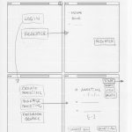
We start with sketches and Low-Fi Prototype
Sketches
I usually start the design process with low fidelity sketches. This is the way I iterate through many design options quickly.
- the main purpose of our sketches was to start testing, presenting and understanding if we have fixed some problems
- We made different versions
- And finally we have choosen to go on with the last one
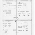
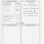
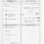
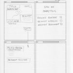
The big difference between Lo-fi and hi-fi is the level of details.
High-fidelity prototypes are the last line of testing before moving on to execution of solutions.
The first reason to use hi-fi prototypes, creating the look and feel, is to develop empathy with users.
The second reason is to make some tests and understand if our solutions were right.
The third reason is to decide between two o more solutions.
To develop empathy with users, we created a strong UI Design, starting from the brand Identity as a real Brand.
We created the Logo with two colors: dark blue and orange, the first to increase the perception of a professional platform, the orange because is the color of the communication, so perfectly coordinated with our aim.
Then we created the Mark, because we know the most of our users will use the platform from mobile.
The palette has red to contrast when we have some alerts, but not a normal red, something like strawberry. Different tones of blue and orange to engage users and put in evidence with joyful colors.
We choose two fonts, one for the Body copy and one for the Headline
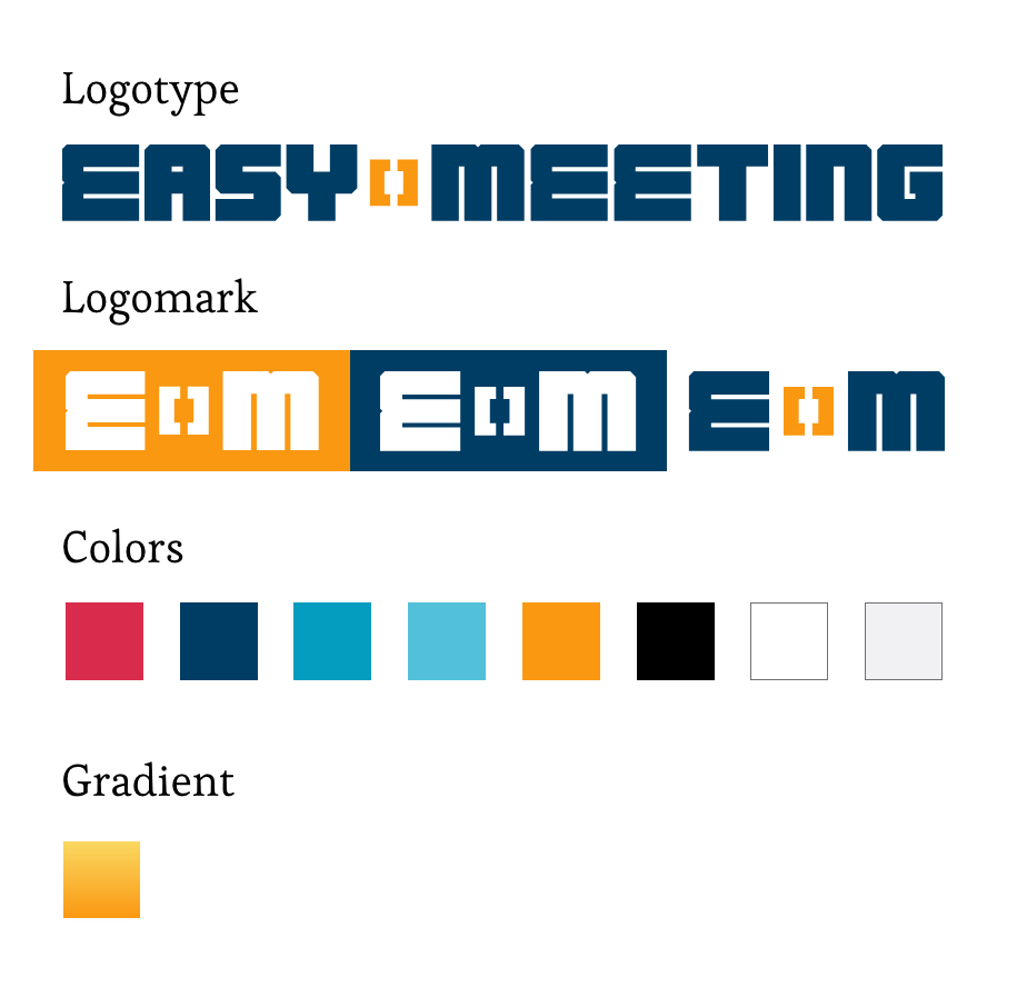
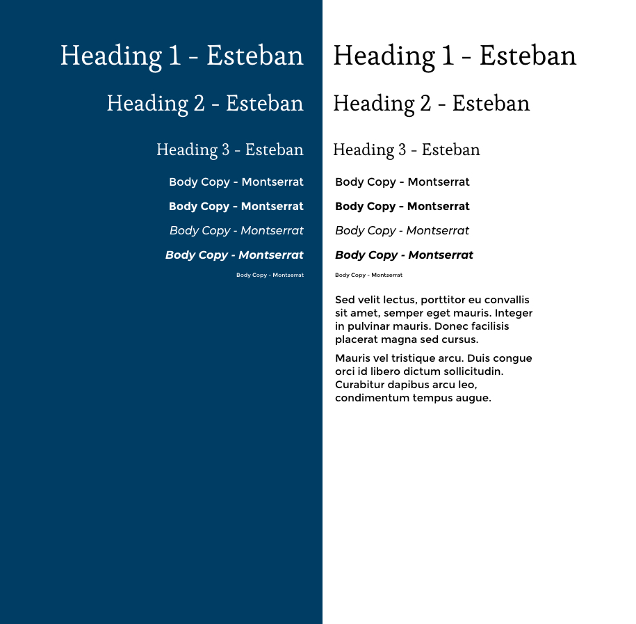
So we created all the graphic assets with intuitive icons, really close to the common system, then the users feels more confident with the platform.
![]()
We made some tests then we understood that users were confusing about the button of “delete meeting”, because the button Delete is something that you usually find when you manage something.
We decided to remove it and make them able to manage all the functions in the page of the meetings by drop-down menu each meetings and a “select” button to delete more than one.
Try on line the prototype!
https://www.youtube.com/watch?v=9dJRUHlsjRY
0
Interaction
0
Screens
0
%
More users
0
Cups of Coffee
“This is absolutely amazing, thanks so much for sharing! I’ll be sure to share it with the larger IDF team so that everyone can see the great work coming out of your efforts!”
Mads Soegaard
Founder, The Interaction Design Foundation