

A collaboration with Annalisa Cosentino (Digital Twilight) to create the rebranding of La Fabbrica di Zurigo, a swiss foundation based in Zurich.
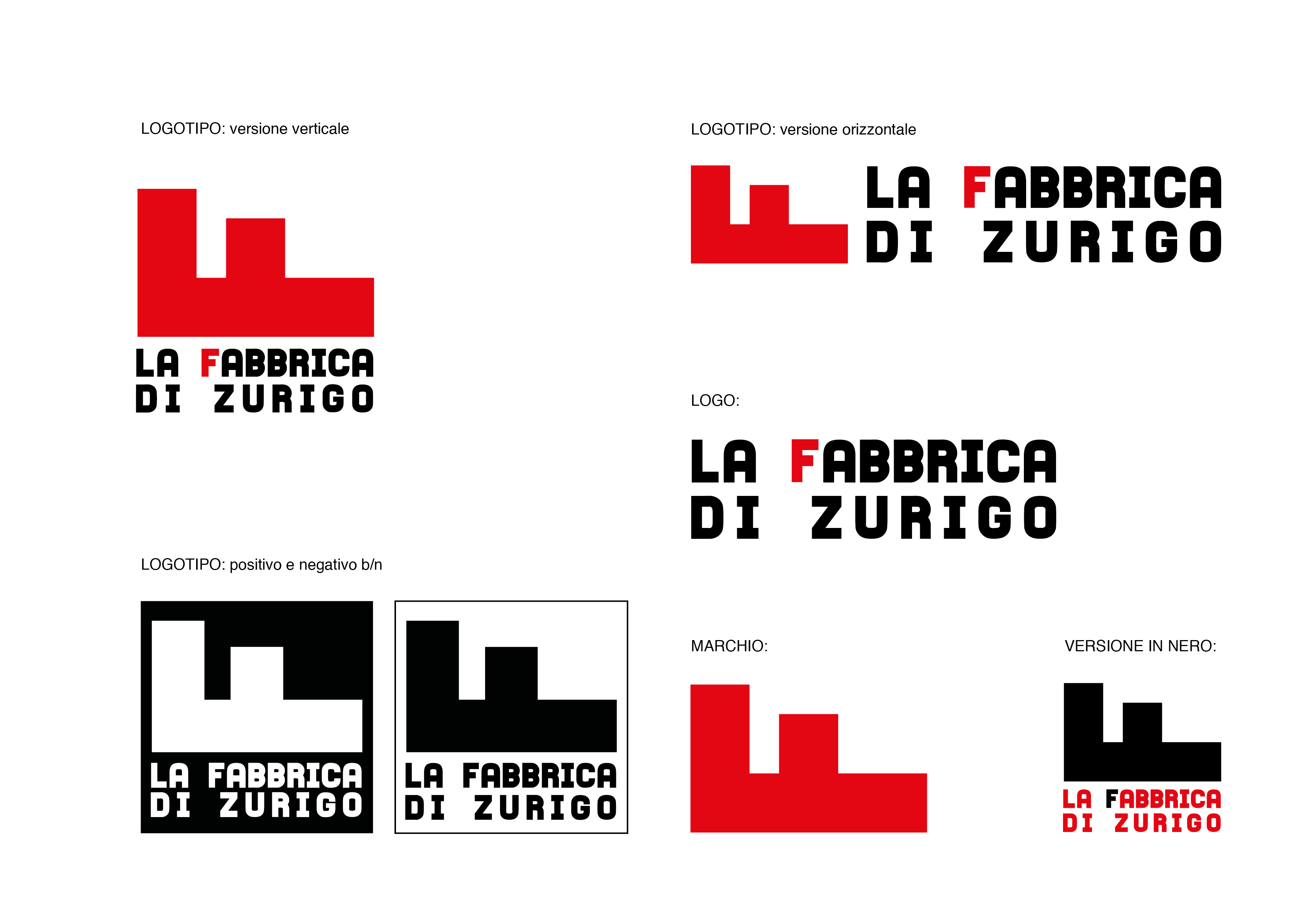
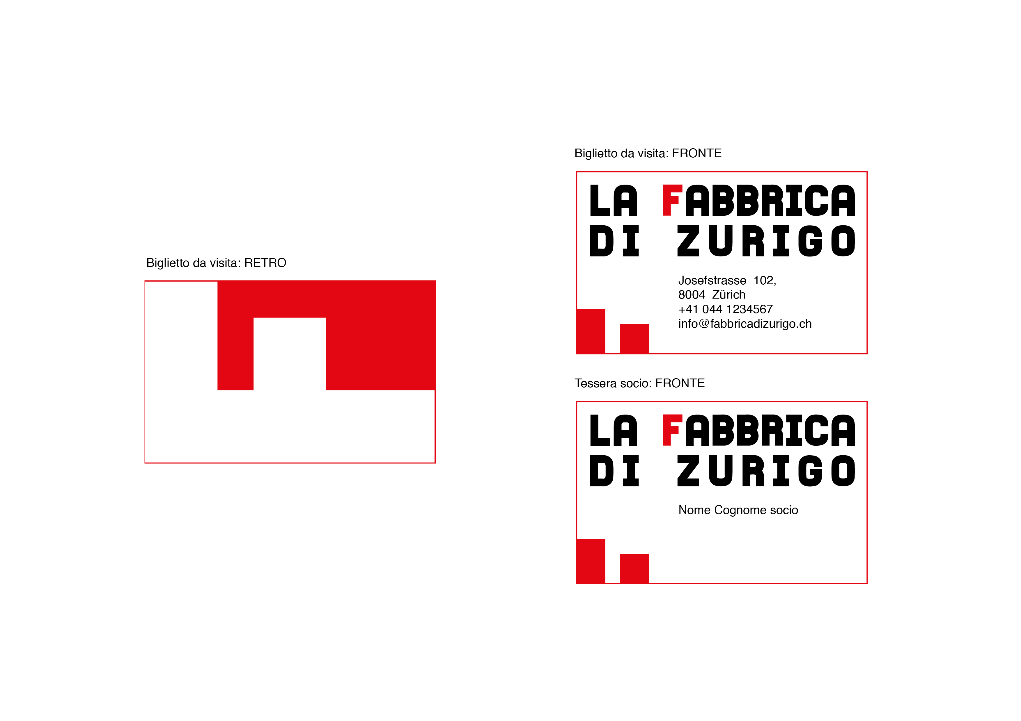
In this proposal we find a logo that makes the “F” of Fabbrica its strong point. In fact, we have a lying F that recalls the image of two factory towers (there are also two towers that represent Zurich). The originality and the simplicity that it transpires seem to perfectly fulfill the significant path wanted from the beginning creating two readings both valid and belonging to the same brand.
The red color seems to be the most appropriate for the context it will represent.
The character chosen for the logo gives an idea of compactness and consistency, qualities necessary to transmit the brand’s reliability and credibility.